Showing posts with label tutorials. Show all posts

Sky Retouch Tutorial

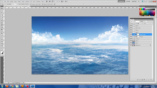
I retouched the image of cloud with sky like when you're looking through out from the window of the cabin aircraft. But I needed to make it looks above realistic too. This job was not so difficult as I used not many sources from Google to retouch. I would like to teach you too.

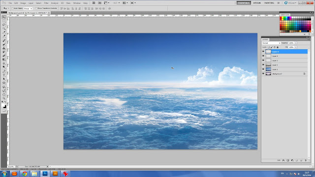
I found one photo of an atmosphere I were looking for. Luckily, it's very high resolution.


Prepare the sky, which I downloaded,  in Photoshop.


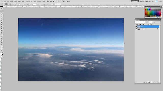
I think the upper part is a bit dark. So I use Rectangular Selection Tool to crop entirely of the upper part.


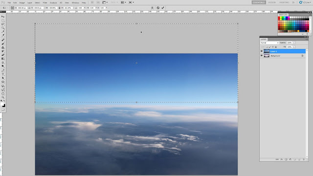
Right click when I am still using the Rectangle tool, then stretch it out off the top of the canvas.


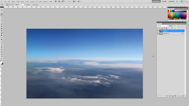
Now this part looks become lighter as I stretched the lighter part to replace the darken part. After that I use selection tool names Lasso to draw and crop on the cloud like this.


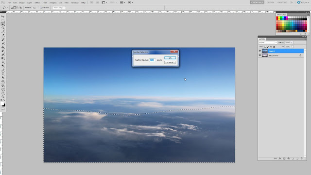
Right click, then select Feather. Because this wallpaper size is about 4 X 2.5 m. I type 250 px in the box to make a lot feather and this value is suitable for this canvas resolution in order to make a lot feather.


You won't see anything change with your dash line. But if you notice carefully, you may see its dash curve looks more smooth. Actually I need to adjust this cloud part looks more lighte. I use Level command by press Ctrl+L. Move the right arrow more to the left. It will make everything inside a dash line looks more light.


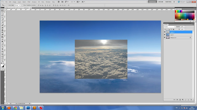
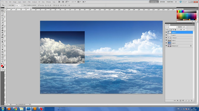
Paste a photo that has different feature of cloud which I have downloaded from Google before.


Stretch it to cover entire the cloud area. Then use filter from my layer box, a drop down list at top left. Now you see my second photo of cloud seems embedded smoothly into my background.


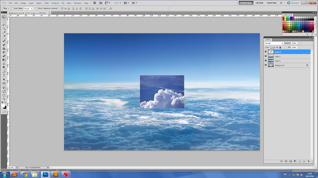
Now I start to make some cloud shape looks like a hill.


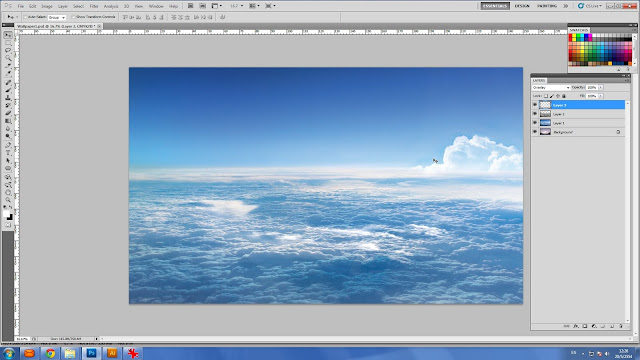
The right part at far horizontal is may appropriate location for this cloud. This time I use Screen Filter from my layer box and use Ctrl + L to adjust until the dark part of the cloud looks harmoniously to my sky background.


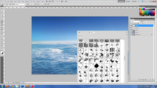
I made more various clouds by right click, then scroll to find another cloud brush, which I have in my store.


The new cloud looks behind the previous cloud.


To make this cloud higher. I merge between the 1st and 2nd cloud together then duplicate it and move up a little bit.


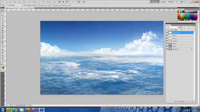
More cloud at the left part to compensate weight of looking.


It is the same. Use Screen Filter and retouch to make it looks the same as the right cloud.


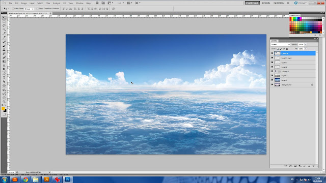
More CLOUD!!


Look nicer?


Perfect!!...Now I have my sky wallpaper.


Read More ...

0 opinions


Have you ever curious how professional graphic can cut beautifully an object out from the background? Basically they use "Pen" tool


Anyway, we now presently have many ways to cut an object out from the background that easier than Pen tool, but this tool is the basic one that most of graphic designer might use. So I will teach you how to use the Pen tool to cut and object, which we will use lotus flower in this tutorial.


After you cut eat, I also will teach you how to create nice background like this below.


Go to select "Pen Tool".

Zoom in to same view as my picture below. Normally, graphic designer might just pree"Ctrl + space bar" to zoom in. You will notice your cursor is changed to be magnifier symbol, zoom until your view is the same as below. After you leave your finger from pressing zoom-in hotkey, the symbol is turned back to Pen. Then, click on the same position as below. This is your starting point.

Go to click to second point, then drag until the Pen's arm is shown. Try to control the arm's curve along with lotus shape.

 Press "Alt", and keep holding, then left click on the second point you have made. Notice that one arm has been eliminated.

Step to click the third point, drag it until the arms occurred. Control the curve along with the lotus shape.

 Do the same thing before, "Alt + left click" to eliminate arms.

Go on...Go on...Keep Go on..!!!


Now you have reached to the starting point.

 Press "Ctrl+Enter" to change  from path to dash line, this is the selection line of the lotus flower.

Press "Ctrl+C" to copy the flower. Now your lotus has been recorded in your memory. After that press "Ctrl+V" to paste lotus on the same position. You won't see anything change until you see one layer occurred over the background layer. That is the cut lotus on the new layer.

Go to select background layer at your layer box. Select blue color. Make sure that two small boxes of color at the bottom of toolbox, the blue color is the one at the top left.  Press "Atl+Enter" to fill blue color entire background area. This step is not necessary. I just want to show you the lotus has been really cut from background.


After you cut and paste the object, on the blue layer, You can retouch shade to make it looks interesting, which I used Burn Tool. Right click on the canvas, then adjust your brush size, this case, I quite used large brush, which I scrolled a bit far to the right. Don't forget to adjust "Range" at the top below the main menu, select " Midtone", this set can make the darker shade looks more contrast. Then use the Burn tool to brush the area that around the Lotus. 


Graphic Retouch Tutorial 3 Slideshow: Yourfriendbryan’s trip from กรุงเทพมหานคร, ไทย to was created by TripAdvisor. See another ไทย slideshow. Create your own stunning free slideshow from your travel photos.
Read More ...

0 opinions

Have you ever curious that how graphic designer can create some shiny effect for their icon or symbol design? Some create in Photoshop, and some make it in Illustrator, which it depends on purpose in using.

There are so many ways to create this kind of effect as well as there are plenty of plugin that can be found on internet, just automatically create in one click. But if you love to create manually, here's the tips...


Step 1 : Prepare Your Canvas
Press "Ctrl+N" to call "New Document" dialog. Set pixel value for width/height to 2000/2000 pixels. This is not strict how your canvas size would be. After you finished, then press "OK".


I'm using Illustrator CS5, which my interface would probably differed from yours, but basic functions are the same. Go to your tool box, which is the vertical bar at the left side of your screen, which contains a lot of tool icons. Hold left click on square icon as you see now in my screen capture. It will shows 6 geometrically shape as the sub-menu . Select the Ellipse (because we will draw a ball shape).


Go to "Window" at your "Main Menu" at the top of your screen, select to enable "Gradient Tool".


Now you have "Gradient Tool". Drag it to your right screen, we do not want anything to block you from creating ball on the canvas area. Go to enable "Swatch Tool" in the "Window" at Main Menu. If it has check mark, it's active, no need to click it, unless you have to find it from somewhere at the right of your screen


Now you have the tools for making an initial circle.


Adjust the "Gradient Tool" box that you may accommodate to adjust gradient for the next step.


In Ellipse tool, use another your hand to hold "Shift+Alt" key on your keyboard, then drag to draw a circle on the center of your canvas, like you see in the picture.


Go to click "Pick Tool" at the top of your tool box. Now your cursor is black arrow.


Left click one time on your circle to make sure the circle you drew is being used. Go to select "Gradient" below small two boxes of your tool box.


The circle now has gradient match with "Gradient Tool". But the circle we need is light-dark blue, so we will change it.


Make sure again you are playing with the circle that you created, Go to use your "Pick Tool" the click enable your circle.


At the "Gradient Tool", Double click on small square icon on the left end below the gradient stripe, it tells you that this left side of the gradient stripe is in white color, which relevant to the gradient that showing on the circle. Try to check all formula that showing now in your gradient dialog are the same as mine, then go to double click on this white icon to call more customizes. On this drop down dialog, then go to click the hidden setting, which is the small icon on the top right corner.


Select "CMYK" options.


Adjust color follow to mine, C=100, M=15. Now you can see left part of circle has changed, which relevant to the gradient that showing on gradient stripe.


Adjust the other side of the circle to be darker blue by following my value C=100, M=80.


At the top of your Gradient Tool, change from 'Linear' to 'Radial' .


The circle now looks dimensional.


Go to View, then select Gradient Annotator.


Press "G" on your keyboard to call "Gradient Adjustment" on the circle, which you can adjust color on this arm, or dragging to draw the gradient on circle to be as you want. This stripe related to the the Gradient Stripe in the Gradient dialog.


Hold left click on the "Gradient Annotator" and drag to left and up a little. This can make the circle looks like a real ball, which has one part is lighter and another part is darker.


Step 2 : Create shiny effect
I would like you duplicate the ball then paste in on the same place over the present ball. Press "V" to change mode from gradient to be Pick Tool, then click click the object, press "Ctrl+C" to copy it, then press "Ctrl+F" to paste the new ball over on the same place on the previous ball. You won't see the difference or anything happened, but trust me, now you already have one ball over on another ball.


Open your "Swatch palette", then select white color.


Hold left click on white swatch, drag and drop onto the small square, which now is the lighter blue or on the left side of "Gradient Stripe". Now left side of the ball has changed to white.


Change the darker part to be white as the left part. The ball now is entirely white, but actually it's still in gradient tool. What you need to do is just make the left side of the gradient stripe to be more transparent.


On the left icon, then change its opacity to 0%. Now left side of the ball is transparent.


Press "G" to call gradient arm, or "Gradient Annotator" to be shown over the ball. Try drag vertically from top to bottom until your gradient effect looks the same as mine.


Go to "Tool Box", select "Ellipse".


Draw ellipse shape over the ball, position it at the top part of the ball.


At the "Gradient Stripe", drag the icon over the stripe to the center. it will be divided into two part.


Press "G" to call gradient arm. Drag over the ellipse you have created, then adjust effect until is the same as mine. Swift the effect by just one click at the symbol at the left over your "Gradient Stripe".


Finally, my adjustment looks like this.


Use "Ellipse" draw a circle on any available area.


Use "Gradient Tool" by press "G". Drag your "Gradient Annotator" over the circle, adjust your "Gradient Stripe" the same as mine.


Press the circle to be ellipse shape like example.


Place the gradient ellipse to the bottom of the ball. But the gradient is now overlap it, you must send the gradient ellipse to the back of the ball by press "Ctrl+X" means "Cut" then press "Ctrl+B" means paste to the back.

Congratulation!!, now you have your shiny ball. But what is purpose for using this ball effect. You may need this kind effect for creating logo or one of graphic element. Let me give you some examples.


Read More ...

0 opinions

AdBrite