Showing posts with label key visual. Show all posts

CAT Telecom Public Company Limited wanted to promote that they has firm system in data security, by setting up the competition that invited potential hackers from all over Thailand country, try to hack into CAT's data security. This event names "CAT Cyfence Cybercop Contest 2014".

I joined with MICE in designing key visual, which offered  the idea that present like the CAT's data center, which represented by hugh event's name located at the end of the large maze, and the hackers , which are the digital lines at the bottom part that climbing up the maze wall to get through the maze to the data center.


They thought this looks old (I intended to make it looks ancient way to present like hackers adventuring in the mystery forest to find out this civilized ancient technology), but they needed to make it looks hi-tech. So they decided to make it looks similar to Tron, which there is the CAT's building at the end at the center.


Read More ...

0 opinions

USAID, is the US government agency that purpose in improving lives in the developing world, which they carries out U.S. foreign policy by promoting broad-scale human progress at the same time it expands stable, free societies, creates markets and trade partners for the United States, and fosters good will abroad.

USAID would like to establish the seminar in the Northeastern province in Thailand, which now was in Khonkhaen, under the title "Professionalism in Civil Society Organizations in the Lower Mekong Sub-region". This seminar was set up for the meeting among professional people who works for civil society around Southeast Asian's country. I joined with MICE team in designing key visual, which came up with 3-4 alternatives. I tried to present it in different styles like ; symbolical graphic, sepia/color galleries and art. They finally chose the one that is gallery in color, the last one.


Read More ...

0 opinions

KEY VISUAL DESIGN : SAS FSI FORUM 2014 

From what I understood from the agency's team, they briefed that, SAS was established in helping to gather or transform greatly amount of data in organization into easy data that they can evaluate themselves to find out which way can drive best to their business.

This job was part of the pitching project for launching services names "SAS FSI FORUM 2014", which would invite potential IT managers to know better of what SAS can help in evaluating and improving in organization with the data. From the concept that MICE's team had brainstormed to come up with the idea of represent the SAS services similar to an orchestra instrument that it is a part of performing and come up with successfully beautiful song, they used violin, but SAS didn't agree to use only one specifically musical instrument like violin. So I suggested the team to use the orchestra conductor instead, which the conductor is the person who is the main key to make all musicians perform their show to be the best.

First I designed just like the conductor is waving baton in his hand in the air to draw the light lines that coming out from the baton. I put some music keys along the lines to make it looks not confuse like a wizard.


Then client needed to make curving of the lines looks similar to "S" as it could be represented the "S" in SAS logo, and put their key messages along the curving line too.

Client commented that the "S" curve still was not looked like "S", so I revised it again to be like below.


Read More ...

0 opinions

TYPOGRAPHY : PHOTO FAIR THAILAND 2014 

This was part of the job that I designed for PHOTO FAIR THAILAND 2014, which is the typography that would be shown on the backdrop in activity zone. Guests, which mostly are the photographer in the event would come to take a photograph with my typo or with decorating objects around in this area. First, the team would like to have simple style typo, but I experimented something looks different, but they didn't like it, however I would like to show it here.

I drafted this figure to be my own vector art in Illustrator from the image that is a man is taking a photo, then I used their key messages to be randomly composed around the figure.


Read More ...

0 opinions

KEY VISUAL DESIGN : SAS CIO ROUNDTABLE 2014 

From what I understood from the agency's team, they briefed that, SAS was established in helping to gather or transform greatly amount of data in organization into easy data that they can evaluate themselves to find out which way can drive best to their business.

MICE joined the pitching for the SAS's event, it was the event to invite potential CIOs come to join the dinner at luxurious hotel's restaurant, and get to know what SAS can help their organization, under the event names "SAS CIO ROUNDTABLE 2014".

I suggested the team that it would be great if we could make the overall gimmicks in the event looks gold, I personally think that gold tone can make everything looks premium, most value. So the colors I used are gold contrast with black. I also suggested that if this event would held intentionally to make the CIOs understand and know more SAS, then just designed the backdrop in black with dicut SAS logo in gold color, which may shown effect of lighting behind the logo. For the logo's material, it would be nice if use some gold material that has interesting texture covered on top like formica, shouldn't be entirely smooth. Therefore, from the whole concept, I then came up with the key visual that presented well the idea.

This was the first version before they commented back to make it looks more gold, because too yellow may looks similar to their competitor's logo. This is not the accurate font as they haven't give it to me yet, so I used Arial (Black).


Then, this is what after I changed it to looks more gold.


Read More ...

0 opinions

Event's Graphic Design : HONDA Land of Dream

HONDA had the big event under the theme "Land of Dream", organized by YCOMM, which I have been assigned to design event's logo, stage and mascot (which is not the one on the left side that showing on the stage). I played with HONDA's innovative inventions as to be part of the element on the logo : AZIMO, cars, jet plane, vacuum robot, etc, and the stage design that made in Photoshop.


This below was the template for the poster size A1, it was sent to YCOMM's team to put a text in.


Read More ...

0 opinions

Concert Stage Design : Live for Life

The SAZZY (one of my long-term client) assigned me a new job, to design concert key visual and stage under the theme "Live For Life". This concert will be held at Muak Lek, Saraburi, where this place is surrounded with a mountains and beautiful nature. Various singer bands for life song and celebs would come to join this concert.

These below were the key visuals and stage design that I created for them.


Read More ...

0 opinions

Key Visual and Poster Theme : Big Camera Event 2013

I had a chance to design the key visual and the logo for Big Camera Event 2013, but they didn't choose all these, and suggested me to follow the style that they liked, which looked very simple, I understood that point. Anyway, I like my designs and need to show you in here. Please feel free to comment.


Read More ...

0 opinions

Key Visual Design : King Bhumibol's Initiated Projects

RDPB (Office of The Royal Development Projects Board) is the firm foundation for practical supporting to our King Bhumibol's initiated projects. They would like to educate people to know how our his project could help Thai people, which mainly involve to vetiver plant, solving saline soils, headwaters dike, windmill, Bio-diesel, other alternative energy, etc. So I designed 4 mains project by curving the elements and composed them to form like global shape, to make a feel of global nature and explain completely his projects.

This below was the key visual, which other designers would used for other medias later.


Read More ...

0 opinions

Key Visual Design : Computer Olympic 2011

This was the key visual for Computer Olympic 2011 that was held in my country. I came up with figure of Thai architecture that has the sunset effect behind, with blooming digital lotus up from the sun.


Read More ...

0 opinions

Event Design : Microsoft Join the NEW Efficiency 2010


During the time that I worked at MICE. We have won in pitching for a Microsoft's big event of. The purpose of the event was to launch the new services under the key concept "Join the NEW Efficiency". Microsoft wanted to send the message that they can provide one-stop service for large business enterprise, by combining 3 outstanding products. They wanted to keep mood and tone looks relax but creatively smart. This key visual had been laid the conceptual graphic before from the headquarter in USA. But the source files I got are quite low resolution, not perfect one to use for printing. I must necessary to drafted it all over again.

This below is another version of the key visual.


From the key visual, it had been branched to other medias : banners, booth banners, leaflet, agenda posters, sponsor banners, buntings, booklets and every signages.


These are lucky draw desktop. It would be shown after finishing the seminar and announced the prize by celeb as the event's moderator.


Medias in booth area.


Agenda Rollup

Roll play scenes. The show had been set to play before starting seminar.


Read More ...

0 opinions

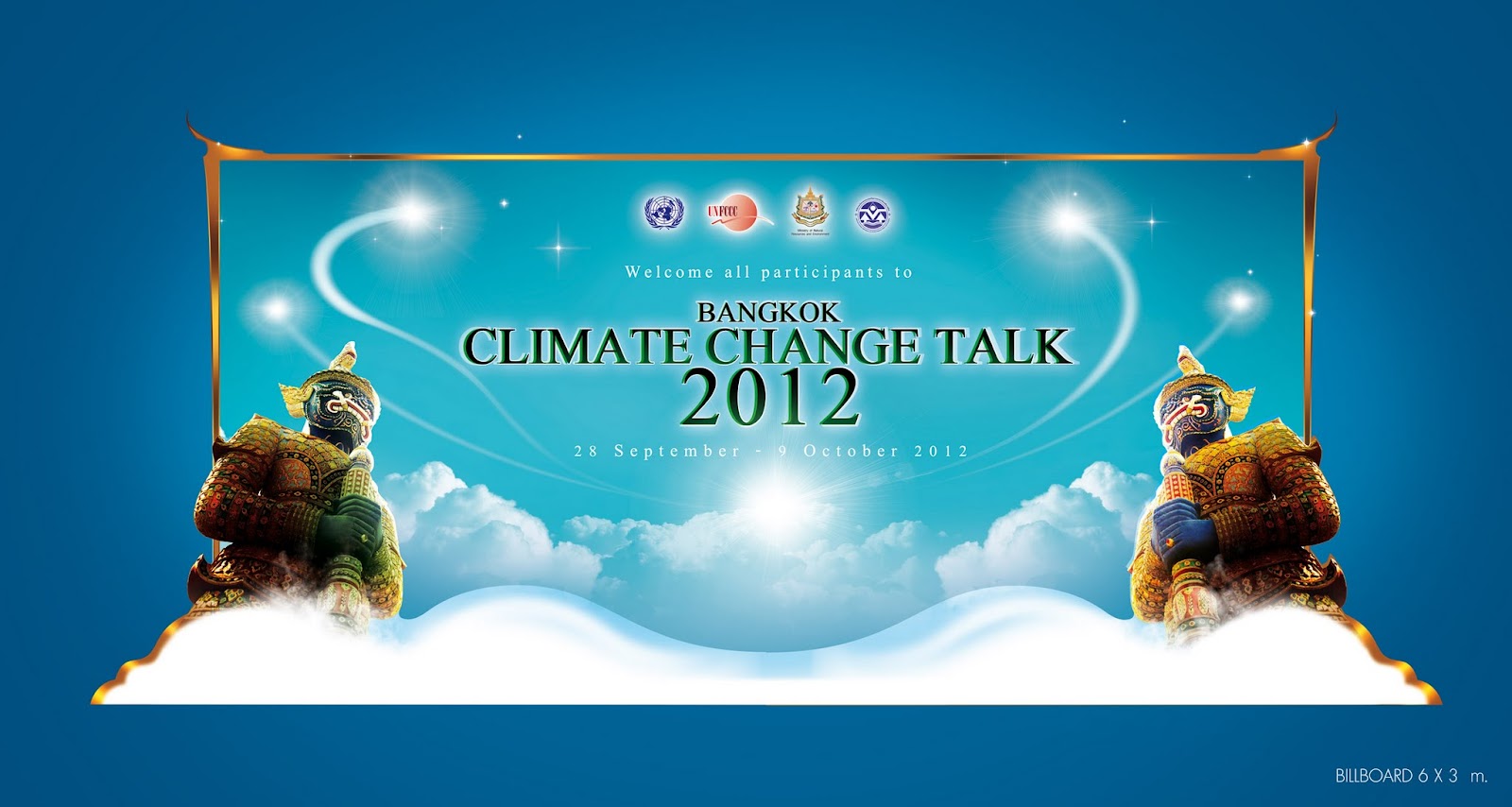
Event Design : Bangkok Climate Change Conference 2012

The concept was focused to Thai tourism gimmick. Client would like to have two Thai giants standing on each left and right side in the key visual. 

This below was the stage for welcome dinner.


And the billboard design, which they chose the one that is landscape rectangle.


The last work was LED touchscreen podium, which has some figure of old Thai city that decorated at the top, LED touchscreen would be set at the middle covered with acrylic and water-pattern sticker. There would have some effect of water movement go from left to right, which is occurred by 3 lights that set inside the podium.

Read More ...

0 opinions

Photoshop Retouch : Raging Tornado

National Science Museum's team organized the big event of the year names Science Festival 2012. One of the key visual they needed to express to audience is about tornado disaster. I added some gimmick like British bus escaping away from tornado, which they had already prepared story in the event that link to the theme I designed. this theme will be branched to many graphics for promoting the event.


Read More ...

0 opinions

GRAPHIC FOR KEY VISUAL : CAT - CHANGE THE WAY YOUR BUSINESS CONNECTS

CAT is a state enterprise in telecommunication, or known as CAT Telecom Public Company Limited. They would like to send their messages to customers that they can provide very efficient services . And this event organized by MICE & Communication, which I joined with them in the part of key visual design.

I have been assigned to design key visual by developing further from the old concept as the first below, which I think personally looks nice and clean, it's created by one designer in MICE's team, but ex-bossed needed something looks more powerful, So I re-designed to becomes like the 2nd one.


Read More ...

0 opinions

SUBMERGED BANGKOK RETOUCH : SCIENCE FESTIVAL 2012's KEY VISUAL DESIGN


This was the 2nd design for the key visual of Science Festival 2012, which about disaster that presenting Bangkok city has already been submerged under the water after huge tidal wave had hit. I put our well-known elements : Thai giant,the tallest skyscraper names "Bhaiyoke", to make people understanding that it's Bangkok capital. I will show you my steps when I were retouching them to become the finished one.


Read More ...

0 opinions

AdBrite